Roy Lichtenstein
Roy Lichtenstein
Hover to zoom
Roy Lichtenstein
Roy Lichtenstein

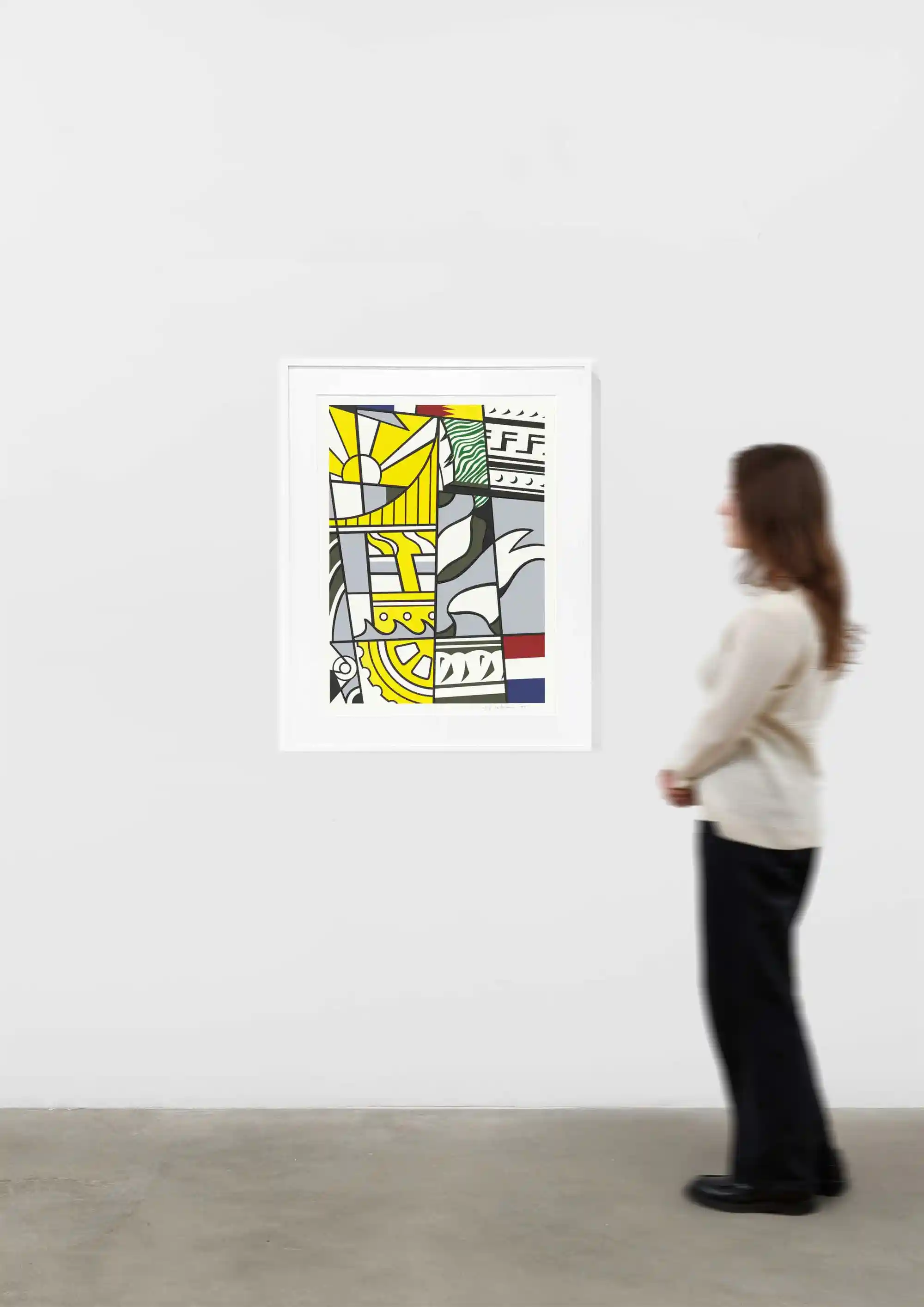
Bicentennial Print

30 1/16 x 22 5/16inches
Roy Lichtenstein

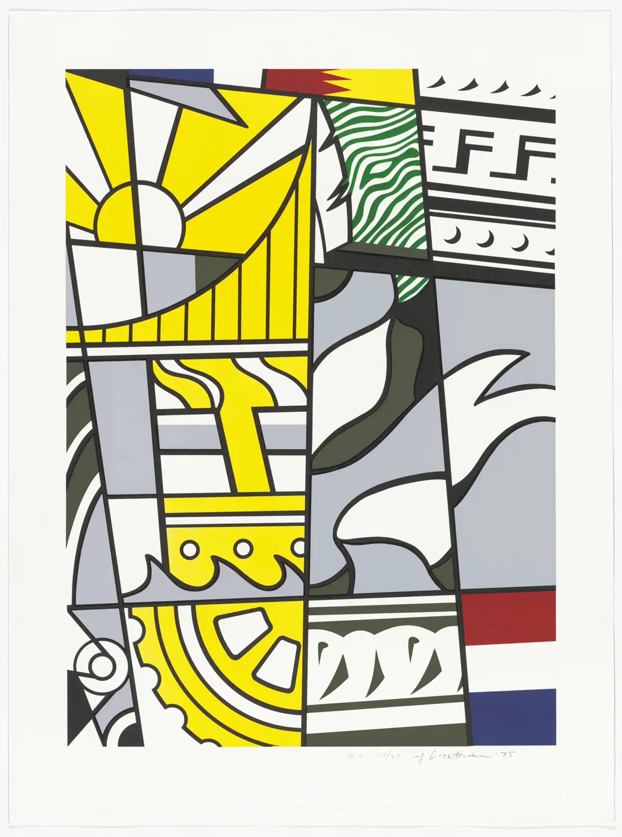
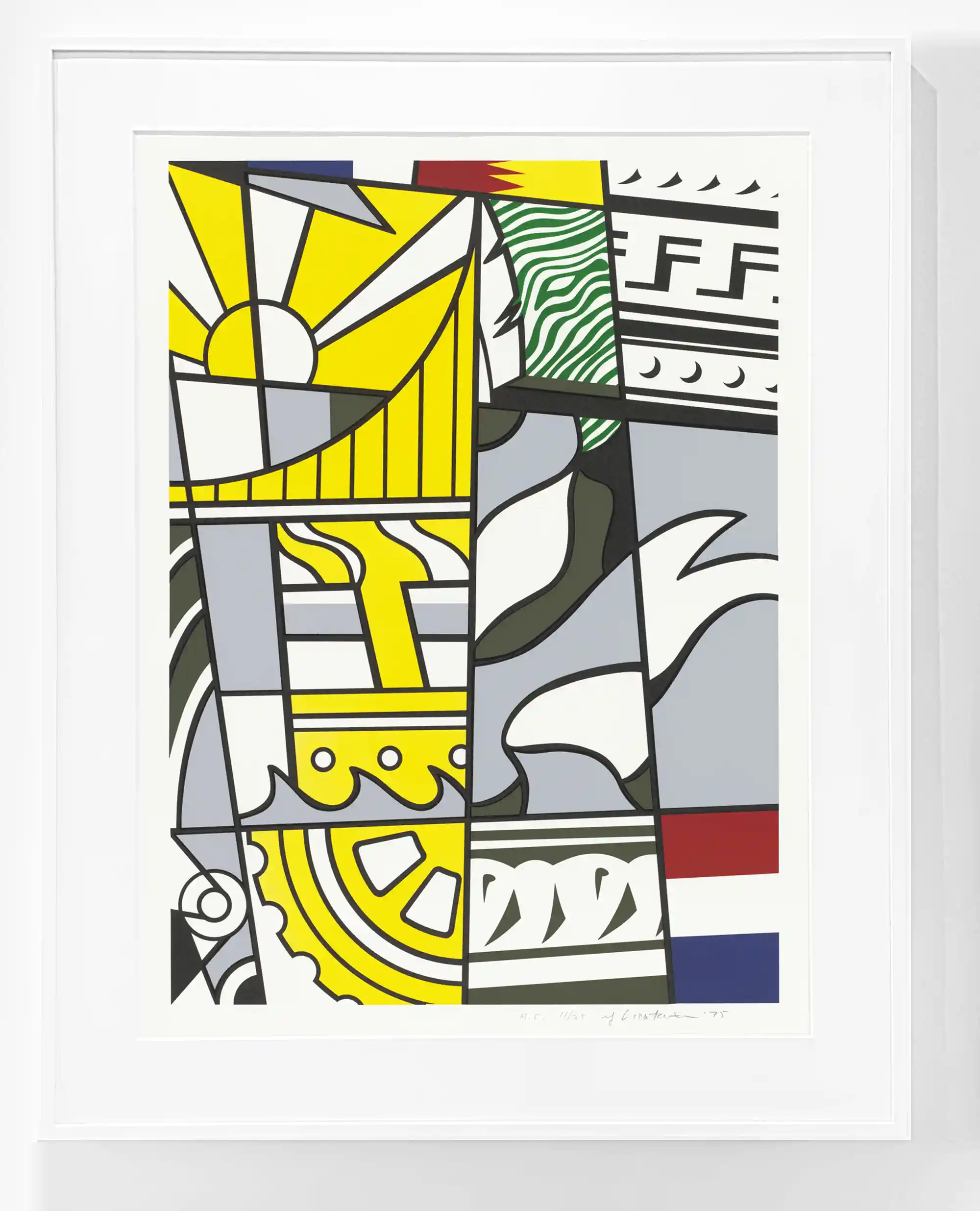
Bicentennial Print
(Corlett 136), 1975

7 color lithograph and silkscreen on white wove paper
paper: 30 1/16 x 22 5/16 inches
image: 25 x 18 1/16 inches
frame: 35 x 27 3/4 inches
edition of 200 plus 25 AP's, 25 HC's
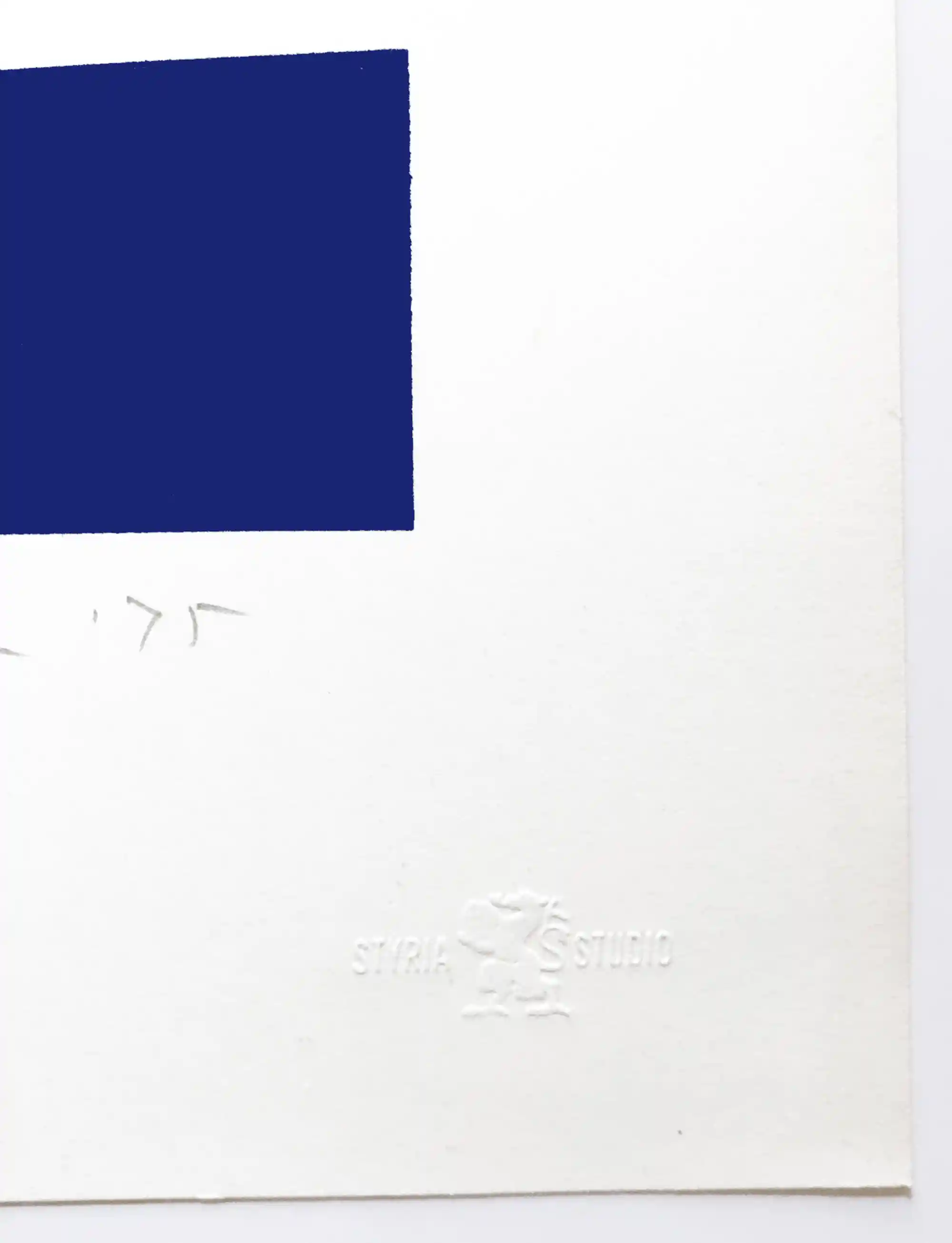
numbered, signed and dated in pencil "rf Lichtenstein '75"
printed by Styria Studio, New York, with their blindstamp lower right
published by APC Editions, division of Chermayeff & Geismar Associates, Inc., New York (and underwritten by Mobil Oil Corporation)

Literature
M. Corlett, The Prints of Roy Lichtenstein: A Catalogue Raisonne 1948-1993, New York, 1994, no. 136 another impression reproduced in color, pg 140.

Museum collections
Indianapolis Museum of Art, Indianapolis, IN
National Gallery of Art, Washington, D.C.
The Museum of Modern Art, New York, NY
Albright-Knox, Buffalo, NY
Irish Museum of Art, Dublin

Full documentation: Roy Lichtenstein Foundation
Inquire 

During the American Bicentennial of 1976 America's acquiescence to capital was scrutinized intensely. Roy Lichtenstein supported a liberal America, as his studio assistant, James DePasquale, recalls. For instance, the proceeds from the sale of Lichtenstein’s Bicentennial Print went to Change, Inc., which provided emergency grants for working artists, the American Civil Liberties Union, and the New York Civil Liberties Union, demonstrating the artist’s pointed philanthropy.

ROY LICHTENSTEIN BICENTENNIAL

During the American Bicentennial of 1976 America's acquiescence to capital was scrutinized intensely. Roy Lichtenstein supported a liberal America, as his studio assistant, James DePasquale, recalls. For instance, the proceeds from the sale of Lichtenstein’s Bicentennial Print went to Change, Inc., which provided emergency grants for working artists, the American Civil Liberties Union, and the New York Civil Liberties Union, demonstrating the artist’s pointed philanthropy. As the artist remarked years later, by way of a humorous critique, the Greco-Roman origin of the Entablature motifs conferred "fake importance" on those that appropriated it humorous, of course, because he was appropriating it, too.35 But the Bicentennial Poster reminds us that consolidated regimes do not so often adhere to their high-minded founding principles. America itself—its economy, law, and politics—endures, necessarily changed.

Roy Lichtenstein Catalog Raisonne
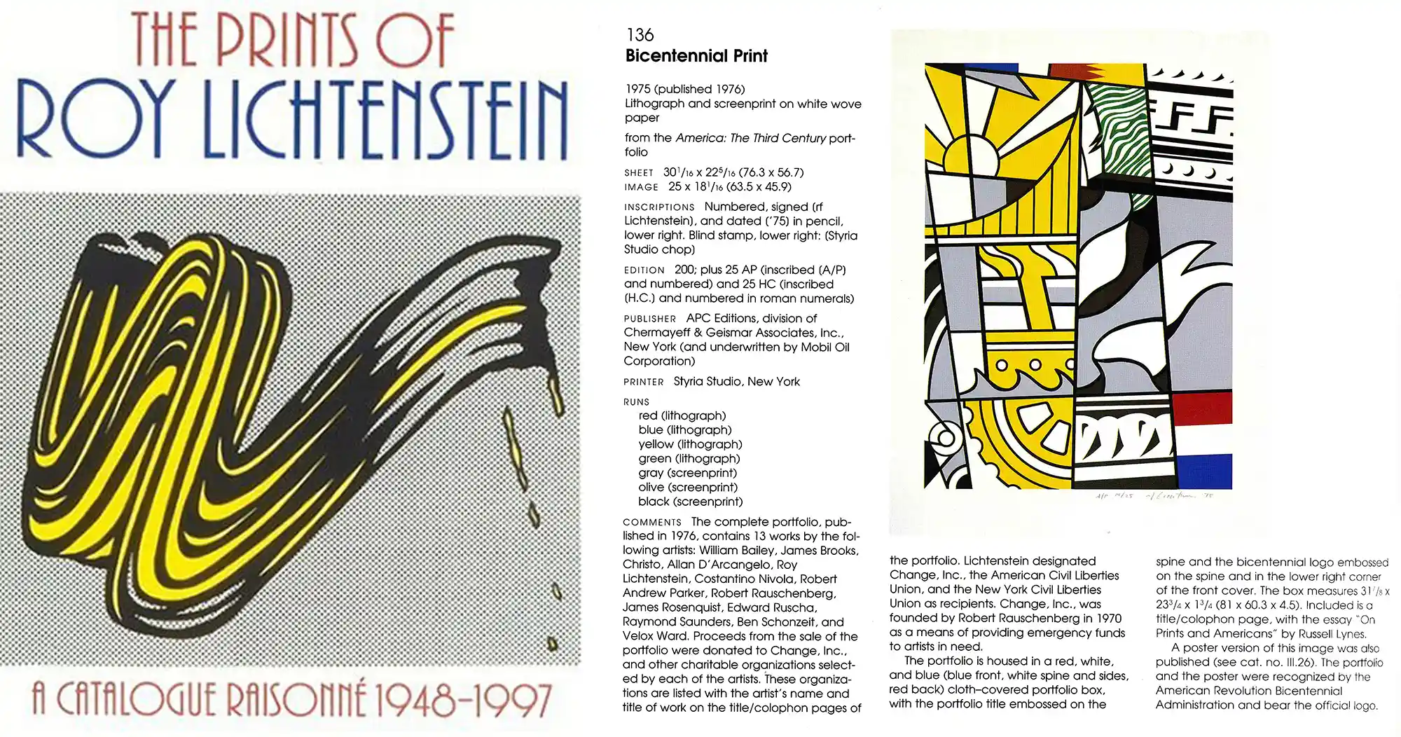
Roy Lichtenstein Bicentennial Print as illustrated in M. Corlett, The Prints of Roy Lichtenstein: A Catalogue Raisonne

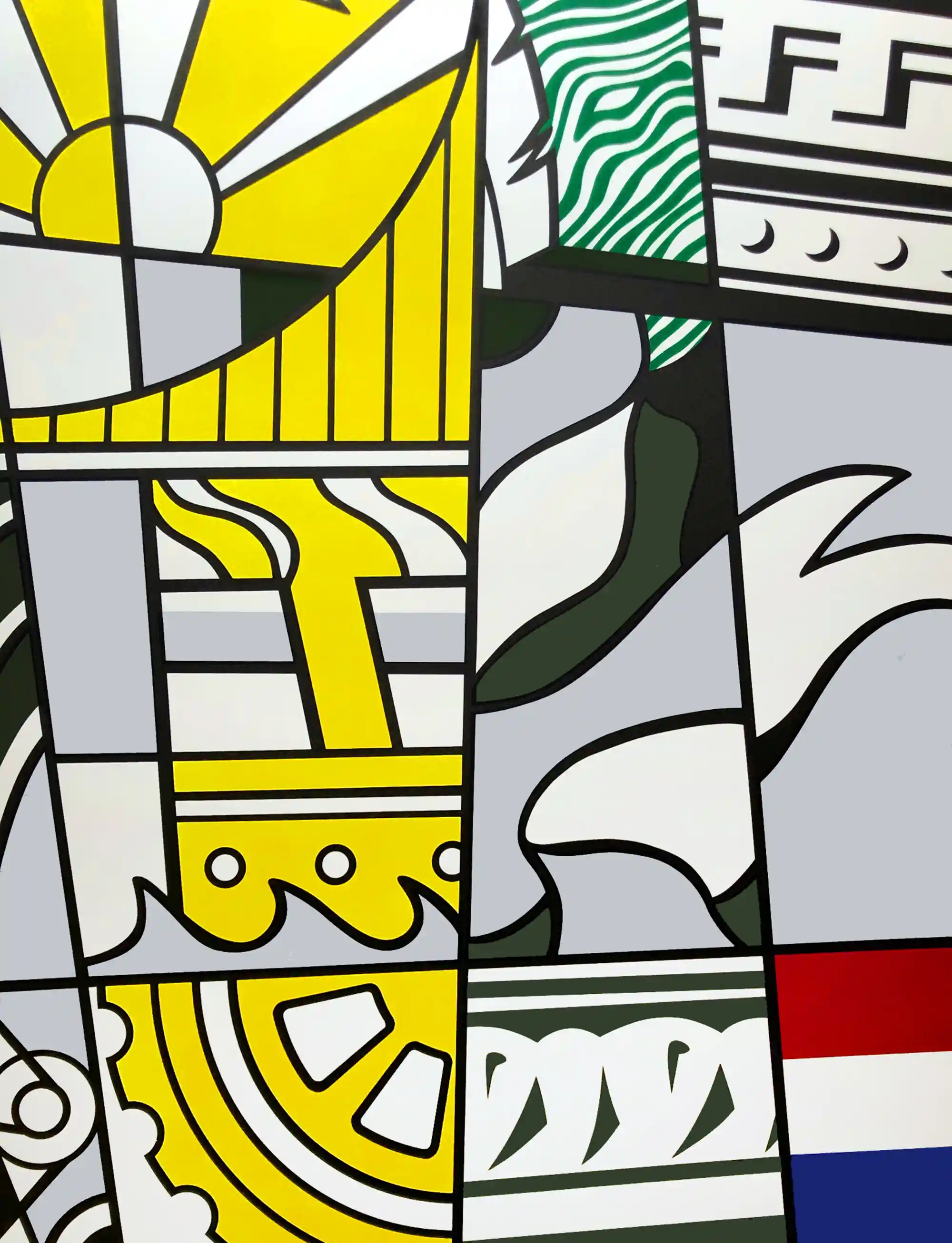
The difference between Lichtenstein’s interests in Art Deco and neoclassical details illustrate the artist’s need for obvious seriousness in the Bicentennial print. Lichtenstein had begun working on Art Deco architectural motifs in 1966 with the Lincoln Center Poster and the Modern series. These works were an homage to New York’s storied Deco masterpieces, such as Rockefeller Center, with its stepped, streamlined fronts and aluminum spandrels, and Radio City Music Hall’s ornate geometrical decorations. As Lichtenstein’s studio assistant Carlene Meeker recalls, the artist embraced Deco because it was the quintessence of New York, representing the aspirations of a bygone golden age. It might have made sense to paraphrase Art Deco when turning his hand to the design of the Bicentennial print, given the direct connection to Mobil’s sponsorship and the corporation’s glistening Forty-Second Street headquarters. Instead, Lichtenstein imported other details nostalgic for pre-Depression era industrialism—a gear wheel, pulley, steam ship, the suspender cables and hangers of a bridge—where the iconography was overtly suggestive of American aspiration. Whereas the poster he designed for Lincoln Center in 1966 was meant to bask in the jazzy mood of Manhattan in the 1920s and ‘30s, the Bicentennial print needed gravitas. Thus, Lichtenstein turned to the Entablatures, incorporating the dentil pattern molding at the top right and the modified dart-and-egg pattern at the bottom center. Clearer than before, the classical designs from the Entablatures signify an "establishment" shaken by the Franklin National collapse, Nixon’s reelection, and the unseemly national politics exposed thereafter.