figure6
Jasper Johns
Hover to zoom
Jasper Johns
Jasper Johns

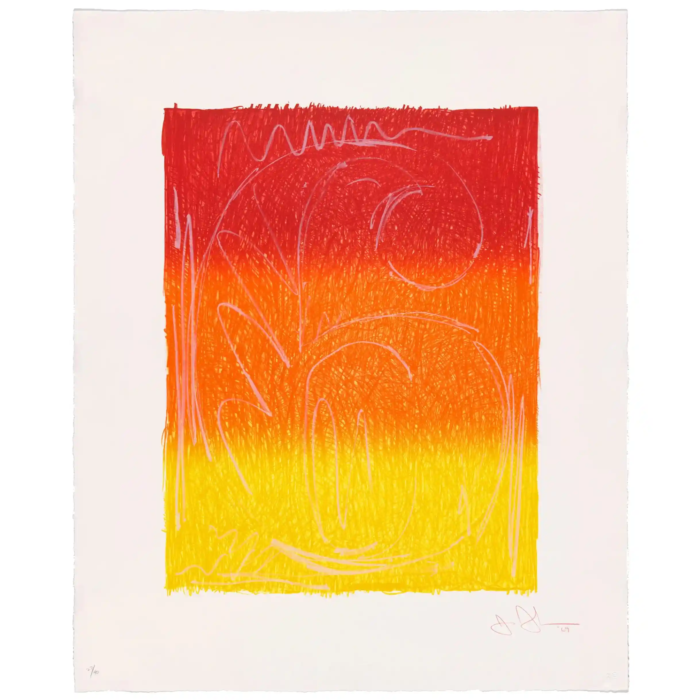
Figure 6

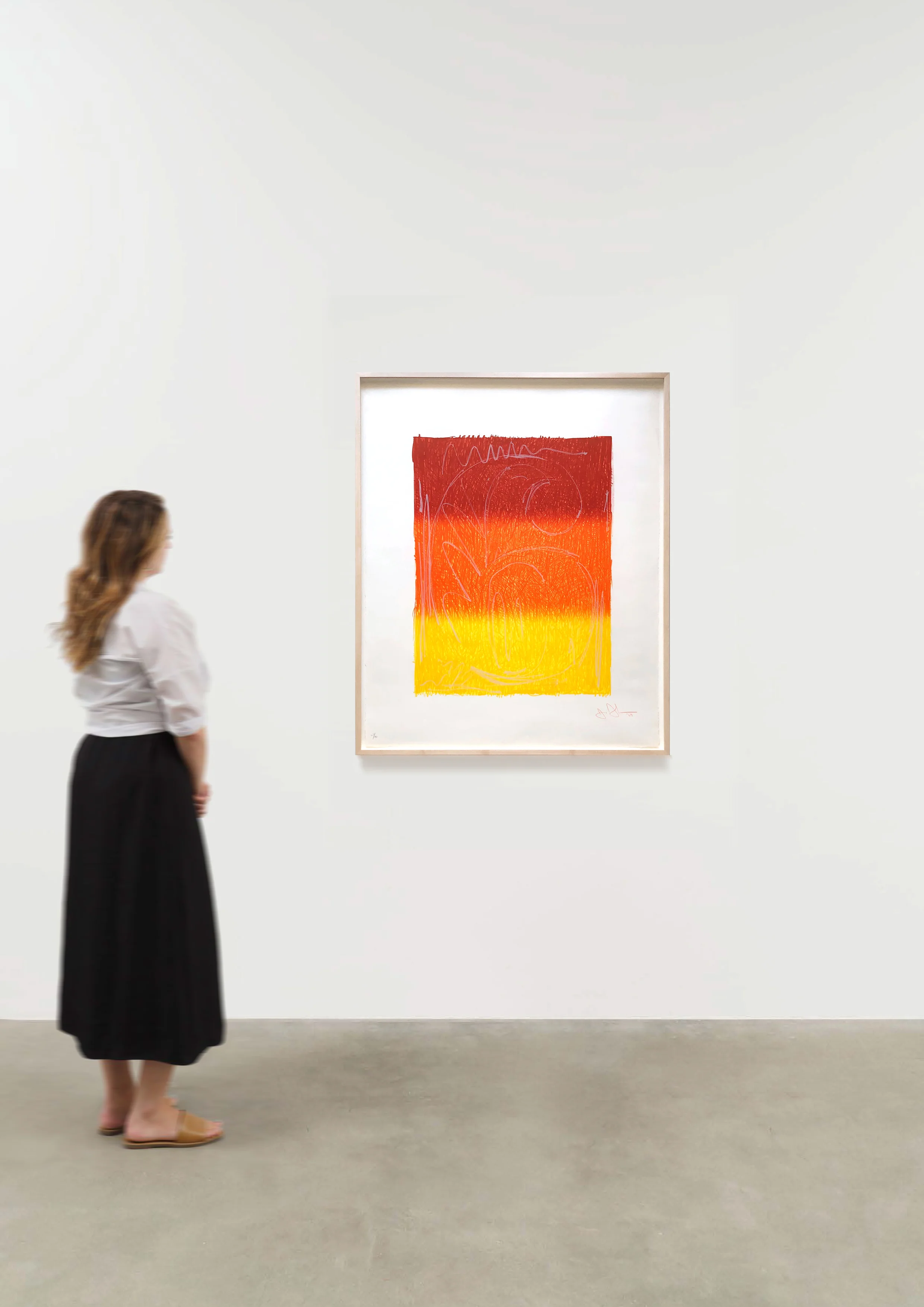
43 1/4 x 56 1/4 inches
Jasper Johns

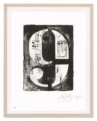
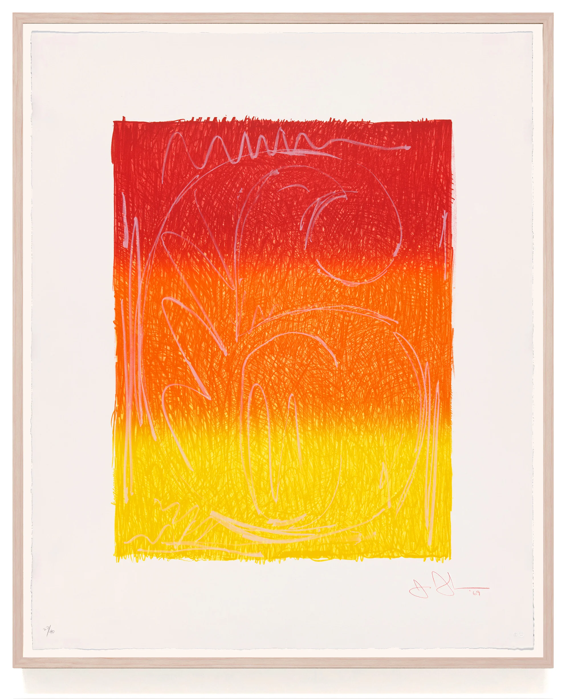
Figure 6 (ULAE 65), 1969

lithograph in colors, on Arjomari paper
image: 27 ½ x 21 ¼ inches
paper: 38 x 31 inches
frame: 42 x 35 inches
edition: 40 with 12 AP's & 1 PP
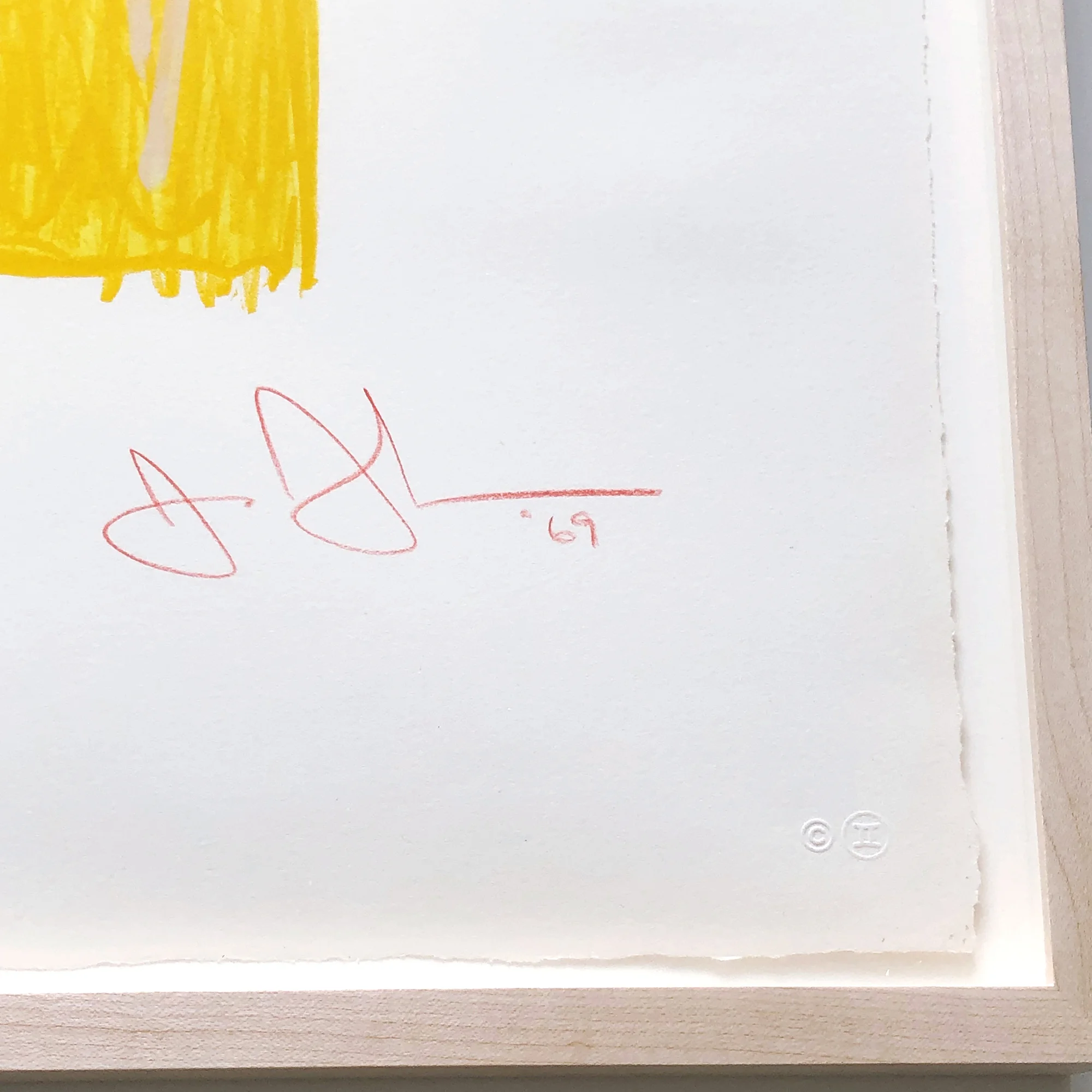
signed & dated in red pencil lower right
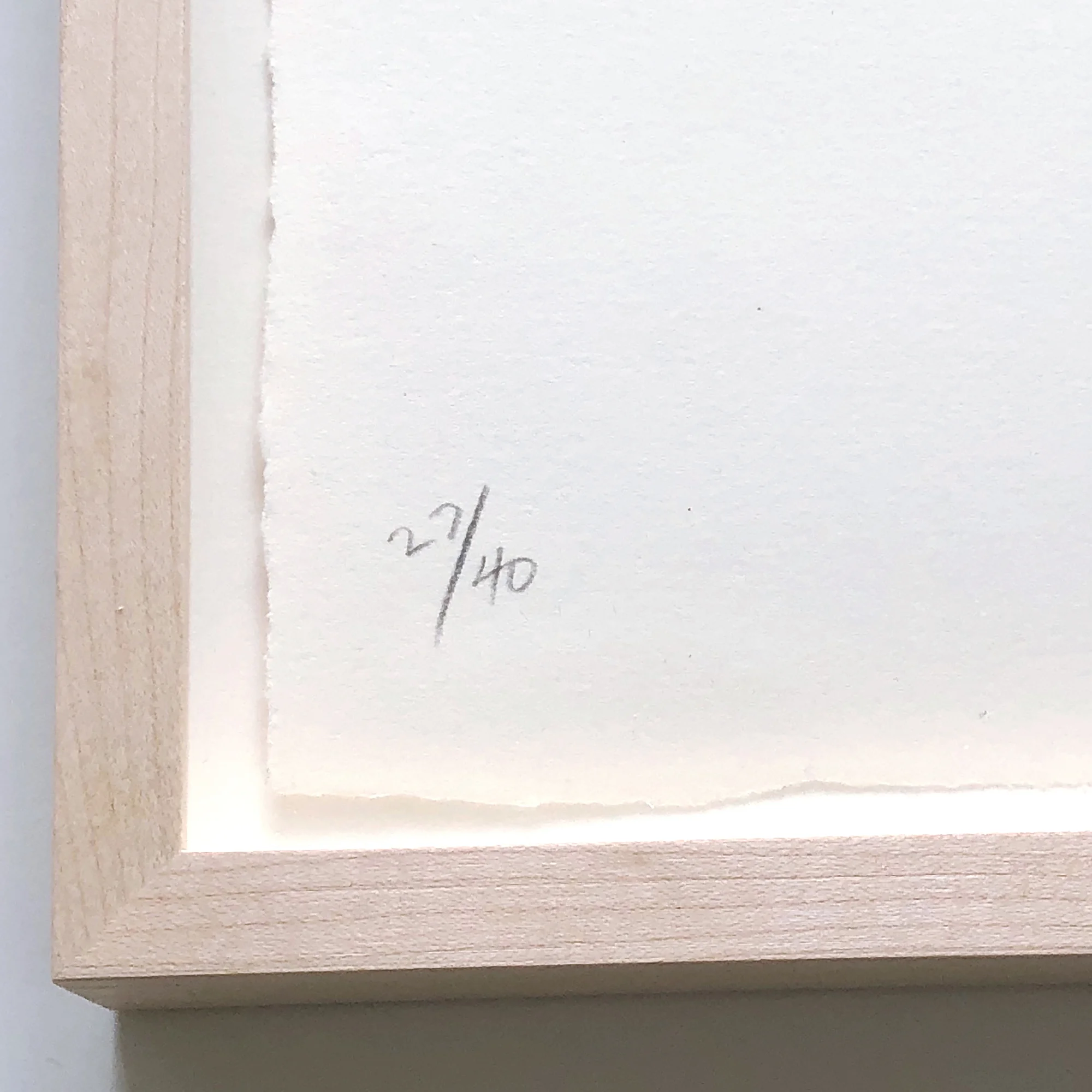
numbered in pencil lower left
published by Gemini G.E.L., Los Angeles, with their blindstamps and inkstamp on the reverse
© 2024 Jasper Johns / Licensed by VAGA at Artists Rights Society (ARS), NY

Literature
Michael Crichton, Jasper Johns, Harry N.Abrams, Inc./The Whitney Museum of Art, New York, 1977, plate 139, n.p., another impression reproduced.
Carlo Huber, Jasper Johns: Graphik, Verlag Klipstein und Kornfeld, Bern, 1970, plate 110, n.p., another impression reproduced in color.
Shigeo Chiba, Jasper Johns Prints Exhibition 1960–1989, Tokyo, 1990, Japan Art and Culture Association/Kokusai Geijutsu Bunka Shinkokai, n.p., plate 8, another impression reproduced.
Michel Butor, Kathleen Slavin, Jasper Johns Gravures Dessins 1960-1991, Foundation Vincent Van Gogh, 1992, no. 7, pg. 52, another impression reproduced in color.
Richard Field, The Prints of Jasper Johns 1960-1993: A Catalogue Raisonne, ULAE, New York, 1994, Catalogue Reference ULAE 65, n.p., another impression reproduced full-page color.
Susan Lorence, Technique and Collaboration in the Prints of Jasper Johns, Castelli Gallery, New York, 1996, Catalogue Reference 12g, n.p., another impression reproduced in black and white
Roberta Bernstein, Carter E. Foster, Jasper Johns Numbers, Cleveland Museum of Art, 2003, pg. 79, another impression reproduced in color.
Carlos Basualdo, Scott Rothkopf, Jasper Johns Mind/Mirror, Whitney Museum of American Art, 2021, another impression reproduced plate 46, pg. 86.

Exhibited
Kunsthalle, Bern, Die Grafik Jasper Johns, April 17-May 29, 1971, another impression exhibited.
Whitney Museum of America Art, New York, Jasper Johns, October 18, 1977-January 22, 1978, another impression exhibited.
Museum Ludwig, Cologne, Jasper Johns, February 10-March 26, 1978, another impression exhibited.
Centre Georges Pompidou, Paris, Jasper Johns, April 18-June 4, 1978, another impression exhibited.
Hayward Gallery, London, Jasper Johns, June 21-July 30, 1978, another impression exhibited.
Seibu Museum of Art, Tokyo, Jasper Johns, August 19-September 26, 1978, another impression exhibited.
San Francisco Museum of Modern Art, San Franscisco, Jasper Johns, October 20-December 10, 1978, another impression exhibited.
The Museum of Modern Art, New York, Jasper Johns: A Print Retrospective, May 19–Aug 19, 1986, another impression exhibited.
The Seibu Museum of Art, Tokyo, Prints Exhibition 1960–1989, Traveled to The Seibu Department Store, Isetan Museum of Art, Tokyo, April 26th—May 15th, 1990, Isetan Department Store, Niigata, June 7-19, 1990, Isetan Department Store, Urawa, July 18-24, 1990, Isetan Department Store, Matsudo, August 9—August 14, 1990, Isetan Department Store, Shizuoka, August 23—August 28, 1990, another impression exhibited.
Foundation Vincent Van Gogh, Arles, Jasper Johns Prints and Drawings from the Castelli collection, July 4-September 30, 1992, another impression exhibited.
Whitney Museum of American Art, New York, Jasper Johns Mind/Mirror, September 29, 2021-February 13, 2022, other impressions exhibited.

Selected Museum Collections
The National Gallery of Art, Washington D.C.
The Museum of Modern Art, New York
Walker Art Center, Minneapolis
National Gallery of Art, Australia
San Francisco Museum of Modern Art, San Franscisco
The Metropolitan Museum of Art, New York
Harvard University Art Museums, Cambridge

Since the mid-1950's, Jasper Johns has reworked key motifs—flags, targets, maps, the alphabet and numbers. Johns depicts subjects that "the mind already knows" but overlooks due to constant exposure. Color Numeral 6 elevates the number, its form derived from a commercial stencil, to a striking, orange-yellow hued portrait. Johns used an abbreviated grid of ten rectangular units for the first versions of a motif called variously “0-9," Ten Numbers or "Numerals." The concentration on a single 0 to 9 sequence creates a closed system like the "Numbers," while allowing more attention to the comparative shapes of individual numerals.
JASPER JOHNS NUMERALS

Since the mid-1950's, Jasper Johns has reworked key motifs—flags, targets, maps, the alphabet and numbers. Johns depicts subjects that "the mind already knows" but overlooks due to constant exposure. Color Numeral 6 elevates the number, its form derived from a commercial stencil, to a striking, orange-yellow hued portrait.

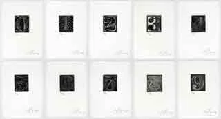
Jasper Johns 0-9 Philadelphia Museum
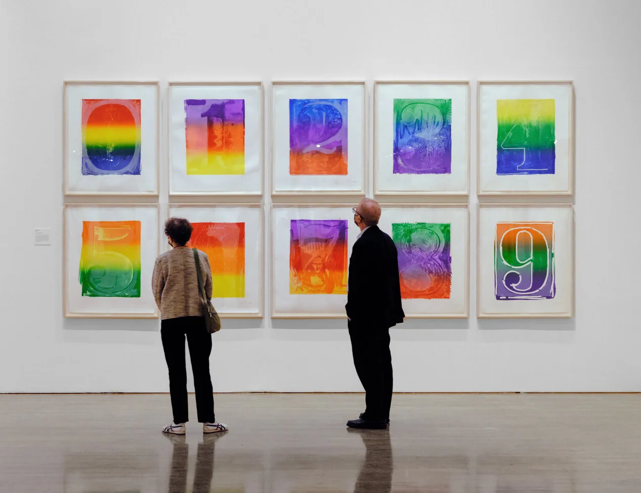
Jasper Johns Color Numeral Series Jasper Johns: Mind/Mirror
Philadelphia Museum of Art.

Johns used an abbreviated grid of ten rectangular units for the first versions of a motif called variously “0-9," Ten Numbers or "Numerals." The concentration on a single 0 to 9 sequence creates a closed system like the "Numbers," while allowing more attention to the comparative shapes of individual Numerals.

During 1958-59, Johns did three paintings, one in white, one in gray and one multicolored, that display the numerals in two equal rows of 0-4 above and 5-9 below. This motif was more fully developed in drawings and prints where he depicted the figures on individual sheets that could be displayed either in two rows or a single row beginning with 0 and ending with 9 or laid out the arrangement on a single sheet. Johns's lithographs 0-9, 1963 combine both ideas by pairing a tablet of ten smaller numerals above and a larger single digit below. The series was conceived in 1960 when Johns drew on the first of three stones Tanya Grosman had delivered to his studio in an effort to entice him to work on prints at her Universal Limited Art Editions lithography workshop. A work in oil, encaustic and graphite on paper from c. 1962 is the first fully developed version of this format. In 1963, when adequate supplies of the right paper were available, Johns took up the project again and made three portfolios of ten lithographs printed in black, gray and colors on papers of three different colors. He used the same stone for the entire project, building each successive image on traces of the last and exploiting the idea of continuity and change inherent in the numerical sequence depicted. Challenging the concept of uniformity in the printmaking process, Johns added a detail printed from a second stone to the numeral within each set corresponding to its edition number. 6 Five years later at Gemini G.E.L., Johns took up the "0-9" motif in two series of lithographs where he continued to exploit the possibilities for sameness and difference that the reproductive medium of printmaking allows. In the Black Numeral Series, 1968 and Color Numeral Series, 1969, different stones were used for each figure and they in turn were enhanced with additions using aluminum plates. The Black Numerals used one stone printed in black and one aluminum plate printed in gray.

For the Color Numerals, the same stones and plates as for the Black Numerals were used, with a second plate for additions in white. The colors were applied to the stone with a large roller, creating a blended spectrum that evolves in a progression of three bands from the primary colors of red, yellow and blue in the 0 to the secondary colors of orange, green and violet in the 9. For both the "Numbers" and “0-9" formats, adhering to the set 0 to 9 arrangement was an important element. This order is the basis of counting and the sequence that is first learned in childhood. In the "Figures," Johns was interested in the relationship of the numerals shapes and tactile presence to the human form. In the works with all ten numbers, the origin of counting and the development of numbers in the digits of the human hand is implicit. During the early 1960s, Johns had reintroduced direct figurative imagery into his works, this time using body imprints as well as anatomical casts. An early example is the lithograph Hand, 1963, where he used his right hand as the primary instrument to mark the surface of the stone in soap and oil. Since this print was made while the 0-9 lithographs were in progress, Johns most likely associated the fingers of the hand with the numerical digits. In the Figure 7 from Color Numeral Series, the handprint is an overt reminder of this connection and the image of the Mona Lisa (reproduced from an iron-on decal and set like a large piece of "collage" into the stem of the 7) provides an amusing capstone to Johns's initial conflation of numbers with human figures. At the same time it acknowledges two of his most admired artistic predecessors, Leonardo da Vinci and Marcel Duchamp, who had appropriated the Leonardo icon for a rectified Readymade in his L.H.O.O.Q., 1919.

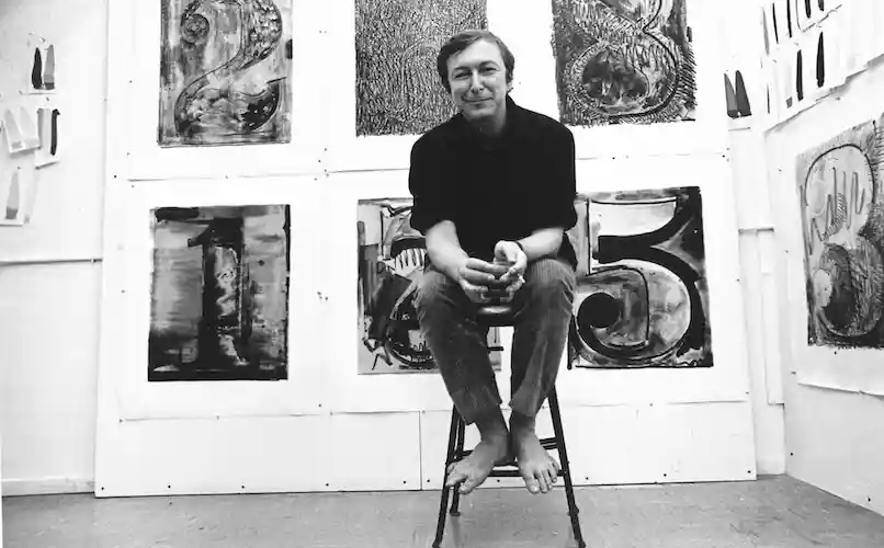
Jasper Johns with proofs for the Numeral series at Gemini G.E.L., in 1968
Jasper Johns with proofs for the Numeral series at Gemini G.E.L., Los Angeles, in 1968
photograph by Malcolm LaLubliner

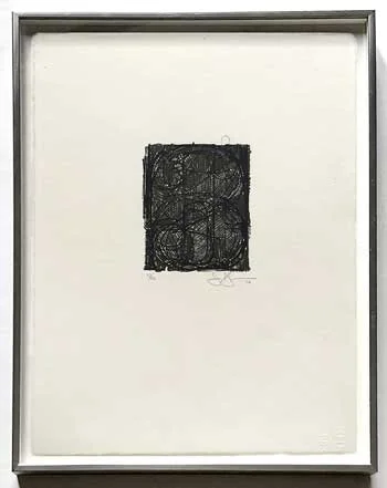
Jasper Johns' exploration of numeric figures began in 1955 and continued into the mid-2000’s; it is the subject to which he has returned most often, exploring it in paintings, drawings, sculpture and prints. Jasper Johns has taken advantage of the opportunity offered by printmaking to test multiple options and pursue different mediums of exploration in his transformation of the numerical object. For example, the lithographic stones and plates that Johns used to print his set of 10 Color Numerals, (ULAE 59-68), 1969 had been reworked from those used to produce the set of 10 Black Numerals, (ULAE 44-53), 1968 a series created the previous year at Gemini GEL.

Writing in Beyond Print: Documenting the living history of the National Gallery of Australia's Kenneth Tyler Printmaking Collection, Emilie Owens observed:

In the late 1960s, under the direction of Ken Tyler, the print workshop Gemini GEL pushed the limits of printmaking, embracing all available technologies. This experimental ethos allowed artists to print on a larger scale and with more freedom than ever before. Created between 1968 and 1969, the ten works in the Color Numeral Series were printed from the same stones Johns had used for his earlier Black Numeral Series. Maintaining the delicate image for a second print series provided a challenge for the Gemini printers: using the ‘rub-up’ technique learned from the French master Marcel Durassier, Tyler managed to create a low-relief image from the flat drawings on the stones, thus preserving the surface and allowing for a longer print-run.

A subsequent problem faced by the Gemini workshop was the inking of the large plates in order to capture the rich, multicoloured finish Johns required. In the artist’s smaller numeral prints, the plate was inked with a regular-sized roller which had been run through the desired colours on a flat palette – a process impossible to replicate on a much larger scale. To achieve the smooth colour gradation the Gemini GEL workshop spent six months researching and adapting inking techniques and using rollers that would cover the large stones smoothly and adequately with a single rotation. The end result was a roller so large it could not be inked by one person. Instead, a hand-fed ‘inking fountain’ had to be devised. This rather complex machine consisted of four rollers which agitated the inks to achieve a slight blending, after which the large roller would be lowered and coated, ready to ink the stone.

Johns said of his printmaking practice: "…it’s the techniques that interest me. My impulse to make prints has nothing to do with my thinking it’s a good way to express myself. It’s more a means to experiment in the technique. What interests me is the technical innovation possible for me in printmaking." His fascination with the possibilities of printmaking and Gemini GEL’s commitment to innovation made for a successful working relationship, to which the lustrous Color Numerals are testament.

The condition of Jasper Johns prints plays a pivotal role in preserving the integrity and value of these artworks. The presence of mat staining, fox marks and attenuated colors can significantly impact the overall aesthetic and historical integrity of these artworks. When considering a purchase of a Jasper Johns print, it is crucial to be wary of dealers who claim prints are in good condition despite such issues, as this may be a deliberate attempt to mislead buyers. Transparency is imperative in the art market and dealers who purposefully omit condition details are not acting in the best interest of the collector. It is also advisable to avoid dealers who artificially enhance colors in photos, distorting the true condition of the artwork. Choosing dealers who provide accurate representations, even if it reveals imperfections, ensures that buyers make well-informed decisions, maintaining the authenticity and value of Jasper Johns prints over time.


More by Jasper Johns
View all by Jasper Johns